I. Introduction: The Enduring Icon of Energy
Imagine you are driving down a long stretch of highway at dusk. The fuel gauge is low, and you are looking for a sign of reliability. Suddenly, you see two bold ribbons of red and blue glowing in the distance. Instantly, you know exactly what it is.
That is the power of the Chevron logo.
It is more than just a symbol for a gas station; it is a hallmark of American business history and one of the most recognizable graphic identities in the world. As a leading energy company, the Chevron Corporation has used this emblem to project trust, power, and service for nearly a century.
Why is the Chevron Logo Important? From a design perspective, the Chevron logo is a masterclass in simplicity and symbolism. It has survived the breakup of monopolies, global wars, and massive industry shifts. For marketers and business owners, understanding this logo is a lesson in how to build a brand identity that stands the test of time.
What You’ll Discover in This Guide In this comprehensive article, we will go far beyond a simple description. You will discover:
- The dramatic history of the Standard Oil Company of California and how it birthed the brand.
- A detailed timeline of the logo evolution.
- The psychological “why” behind the red and blue colors and V-shaped design.
- Official brand guidelines and how to access vector logo assets.
II. The Genesis of an Icon: Early Days and Influences (Pre-Chevron Logo Era)
Before there was the red and blue shield, there was a complex web of oil barons and monopolies. To understand the logo, we must look at the roots of the company.
From Pacific Coast Oil to Standard Oil of California
The story begins in 1879 with the founding of the Pacific Coast Oil Company. Located in California, this company was distinct from the massive East Coast empire of John D. Rockefeller. However, the allure of California’s oil was too strong, and eventually, Rockefeller’s Standard Oil acquired it.
The Standard Oil Monopoly Breakup In 1911, the U.S. Supreme Court made a historic ruling to break up the Standard Oil monopoly. This split the giant into several smaller “Baby Standards.” One of these was Standard Oil Company of California (SoCal).
Early Branding Attempts For decades, the company struggled with its identity. Because the name “Standard Oil” was used by different independent companies in different states, marketing was a nightmare. They needed a unique trademark that could be used exclusively, regardless of state lines.
The Birth of the “Chevron” Name (1930s)
The company needed a name that sounded premium and authoritative.
- Inspiration for the Term: The term “Chevron” comes from heraldry (coats of arms) and military insignia. It represents a V-shaped pattern signifying rank, protection, and builders (the rafters of a roof).
- Initial Use: Before it was a company name, “Chevron” was introduced as a product brand for a premium gasoline in the 1930s. It was so successful that the symbol eventually swallowed the parent company’s identity.
III. The Evolution of the Chevron Logo: A Visual Timeline
The logo evolution of Chevron is a fascinating study in “de-cluttering.” Over the decades, the brand has moved from complex illustrations to the sleek, minimalist company emblem we see today.
1. The First Chevron Logo (1931)
When the Chevron gasoline brand was launched, the logo featured a three-striped design. It consisted of two red stripes and one white stripe (or sometimes a mix of red, white, and blue) in a V-shape.
- Design Elements: It also featured wings, symbolizing speed and flight—a common theme in the 1930s fuel industry (think of the Pegasus logo).
- Significance: This established the V-shaped design as the core visual anchor.
2. Post-War Redesigns and Standardization (1948 – 1960s)
After World War II, the company sought a cohesive look.
- The “Standard” Integration (1948): The logo was updated to include the word “Standard” in the center of the wings. This was to leverage the trust of the Standard Oil name while pushing the Chevron visual.
- Refining the Design: By the 1950s, the “Chevron” name began to take prominence over “Standard” in marketing materials, specifically at gas stations.
3. The Iconic Two-Chevron Mark (1969)
This is the most critical moment in the logo’s history. In 1969, the company (still named Standard Oil of California) officially adopted the Chevron identity for its public face.
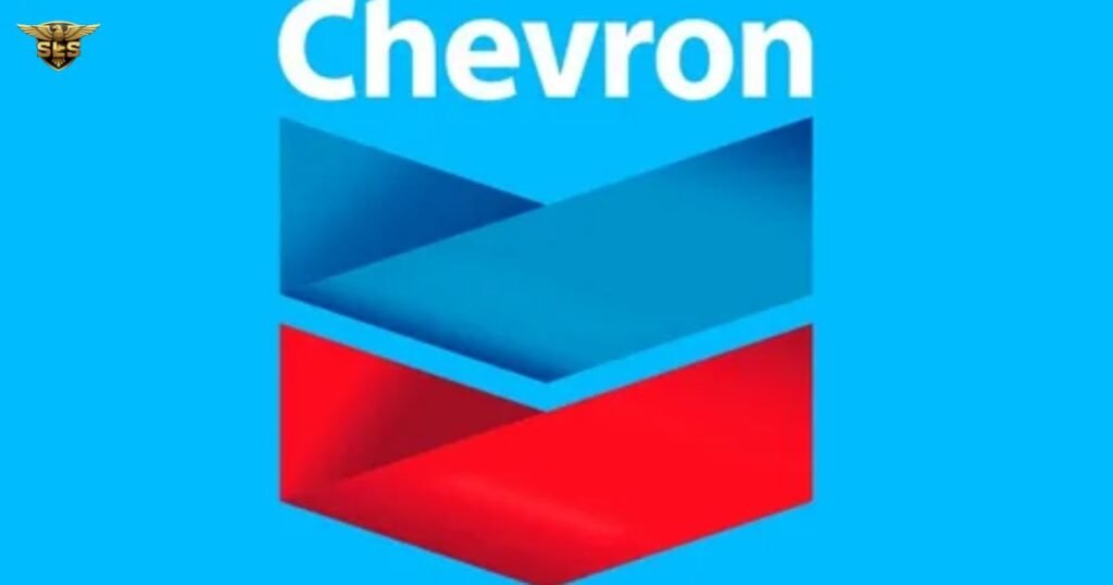
- The Shift from Three to Two: The design was simplified by the famous design firm Lippincott. They removed the wings and the third stripe. The result was two bold ribbons—one red, one blue—folded over each other.
- The Core Palette: This cemented the red and blue colors as the non-negotiable visual identity.
- Typography: The Chevron wordmark was placed at the top, using a customized, bold typeface.
4. Mergers and Modernization (2001 – Present)
The logo underwent further refinement to adapt to the digital age and corporate mergers.
- The ChevronTexaco Era (2001-2005): Following the massive merger with Texaco, the company briefly became ChevronTexaco. The logo remained largely the same, but the branding context changed.
- The Gradient Refresh (2005/2006): To appear more modern and less “flat,” the company introduced a glossy, 3D effect to the ribbons. This “gradient” look made the logo pop on computer screens and smartphone apps.
- Current Logo (2015): The current iteration is a slight refinement of the 2005 version. It is cleaner, with a brighter color palette to signal a cleaner energy future. The font is a modified Handel Gothic, known for its rounded, approachable, yet engineered feel.
Fun Fact: Even though the logo changed, the company didn’t officially change its corporate name from “Standard Oil of California” to “Chevron Corporation” until 1984!
IV. Deconstructing the Chevron Logo: Symbolism and Design Principles
Why does this logo work so well? Let’s break down the graphic design principles at play.
The Power of the V-Shape (The Chevron Symbol)
The chevron is an ancient symbol.
- Military Connection: It is instantly recognizable as a badge of rank (Private, Corporal, Sergeant). This subconsciously commands respect and implies “service.”
- Directional Movement: The V-shape points upward and forward. This symbolizes growth, innovation, and a positive future.
- Heraldry: Historically, the chevron represented the roof of a house, symbolizing protection. For an oil and gas industry giant, this implies protection of your engine and your journey.
Color Psychology: Red and Blue
The red and blue colors are not accidental choices.
- Blue: In color psychology, blue represents intelligence, stability, trust, and professionalism. It is the color of the sky and the ocean (referencing the company’s offshore drilling).
- Red: Red represents energy, passion, power, and determination. It is the fire of combustion.
- Patriotism: Together with the white negative space, the palette evokes the flag of the USA, grounding the brand as an American industrial icon.
Typography and the “Skyscraper” Effect
The font used is a customized version of Handel Gothic. The letters are rounded, which makes the massive corporation feel friendlier and more accessible.
- The “Folded Ribbon”: If you look closely at the top of the logo, the two colors appear to be a single ribbon folded over. This creates a 3D “skyscraper” effect, adding depth and suggesting that the company is multi-faceted.
V. The Chevron Logo in Action: Brand Identity and Marketing
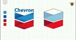
The logo is the anchor of Chevron’s marketing strategy. It appears on everything from oil rigs in the Gulf of Mexico to credit cards in a customer’s wallet.
Reliability and Trustworthiness
Chevron’s primary brand promise is reliability. Their famous tagline, “We Take Better Care of Your Car,” (often associated with their Techron additive) is visually supported by the shield-like logo. The logo acts as a seal of quality.
Related Brands and Sub-Brands
The Chevron logo often sits alongside other heritage brands:
- Texaco: After the merger, the Texaco star remains a distinct logo, but the corporate ownership is often signaled through shared design languages in corporate reports.
- Havoline: The motor oil brand often utilizes the Chevron color palette to ensure brand recognition.
- Standard: In limited areas, Chevron still holds the trademark to the “Standard” name to prevent competitors from using it, sometimes displaying it on stations to maintain the legal right.
VI. Official Chevron Logo Usage Guidelines & Assets
For partners, station owners, and marketers, using the logo correctly is legally required. Misusing a trademark can dilute the brand.
Accessing Official Logo Files
If you are working on a project that requires the logo, you should never simply “right-click and save” a blurry image from Google. You need high-resolution assets.
- Vector Logo (AI, EPS, SVG): These are mathematically calculated lines. You can scale a vector logo to the size of a billboard without losing quality.
- PNG Logo: These are pixel-based images with transparent backgrounds. Best for web use and PowerPoint presentations.
Where to Download: You can find official assets on third-party design resource sites like seeklogo.com or directly through the Chevron Brand Center (requires permission/login for official partners).
The Ultimate Guide to the Houston Texans Logo: History, Meaning, and Evolution
Key Brand Identity Guidelines
To maintain the integrity of the visual identity, follow these rules:
- Clear Space: Always leave “breathing room” around the logo. No text or other graphics should touch the chevron. Usually, the minimum clear space is equal to the height of the letter “C” in the wordmark.
- Do Not Stretch: Never distort the logo. If you resize it, hold the “Shift” key in your design software to maintain proportions.
- Backgrounds:
- Preferred: White or light backgrounds.
- Dark Backgrounds: Use the version with a white outline or the all-white (reversed) version.
- Color Accuracy: The official blue and red must be exact.
- Chevron Blue: Pantone 287 C
- Chevron Red: Pantone 485 C
VII. Common Questions About the Chevron Logo (People Also Ask)
1. What is the meaning behind the Chevron logo?
The logo represents rank (service) and protection (a roof). The V-shape points upward, symbolizing energy, progress, and a positive future direction for the company.
2. What do the colors in the Chevron logo represent?
Blue represents professionalism, trust, and stability. Red represents energy, power, and courage. Together, they reflect the company’s American heritage.
3. When was the Chevron logo last changed?
The most recent significant update was around 2015, where the logo received a brighter, flatter look to optimize it for digital screens, though the 2005 gradient version is still widely recognized.
4. What was the original Chevron logo?
The original 1931 logo featured a three-striped V-shape (red, white, and blue) accompanied by wings to symbolize speed and flight.
5. What font is used in the Chevron logo?
The logotype uses a modified version of Handel Gothic. It is a geometric sans-serif font known for its futuristic yet readable appearance.
6. Where can I download the Chevron logo in vector format?
Vector files are typically available on brand resource websites like brandfetch.com or logos-world.net. Always verify you are using the correct version for your specific use case.
7. Is the Chevron logo related to military chevrons?
Yes, indirectly. The name and shape were inspired by the chevron insignia used in heraldry and military uniforms, symbolizing service and rank.
VIII. Conclusion: A Legacy Forged in Design
The Chevron logo is a testament to the power of consistent branding. It started as a product mark for gasoline and grew to become the face of one of the world’s largest corporations. Through wars, mergers, and the digital revolution, the red and blue stripes have remained a constant symbol of energy and reliability.
Looking ahead, As the world shifts toward renewable energy and sustainability initiatives, the Chevron brand will likely evolve again. However, the core elements—the colors of energy and the shape of progress—are deeply embedded in the public consciousness.
For designers, marketers, and historians, the Chevron logo remains a perfect example of how to say a lot without saying a word.

